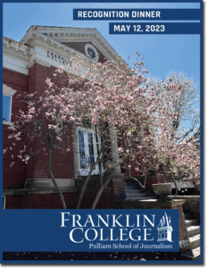
 PSJ Dinner: This was the most pressure I have ever been given for a project outside of a class requirement. Not only was this the first time I was given a proper creative license, but many people outside my peers and professors would also be looking at it. I wanted this to be simple and sleek and show my skills and overall appreciation for what the PSJ represented. That was the whole point of the PSJ dinner. A lot of the format section was easy to complete, but the most fun part was the section where the margin was. I could use Photoshop to add an old feather writing pen with an ink trail behind it. Through a lot of trial and error, the PSJ flyer from 2024 turned out to be greater than I could have ever imagined. I am forever grateful for the opportunity and the skills I learned to create this masterpiece. This was also one of the first projects I could see printed out and distributed to an outside source, with PLENTY of eyes looking at it. Although I had help when needed, if there were one critical mistake on this project, it would affect not only my reputation and the whole reputation of the PSJ, but also that of Franklin College. In retrospect, it would not have been that big of a deal, but the nerves were high for this being my first real project. View PDF
Publication Design:
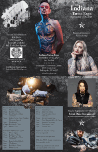 Tattoo flyer: This project has been my favorite I have made to date. We were given the project to create a tri-fold pamphlet for class. As someone recently starting my tattoo journey, I was excited to get this assignment to bring my dream tattoo expo to life. I started by putting down all the elements I wanted within my try-fold: guest appearances, design ideas, schedule, etc. I knew I wanted some ink blotches, which I could find in Adobe Stock photos. Then I traced around the ink blotches, cut out the background, and inserted the image into a new layer so it was basically like there was a hole in the current layer in the shape of ink blotches; only that part cut out, you could see through to the other layers. I wanted to incorporate another aspect of this project: the black and gray background design with the traditional and classic tattoo embroidered design. The analytical aspect of this design was the 5 W’s: Who, what, when, where, and why, which is where the schedule comes into play. I made it a two-day-long event, so there was plenty of time to cover my “5 W’s bases, and it entailed an opening, along with other events, guest appearances, and a closing ceremony. All within that, there were addresses and hotel information. The guest appearances were Dave Navarro and Ryan Ashley, all judges who starred on Ink Masters. View PDF
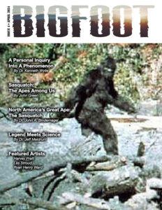 Bigfoot Magazine: Compared to some of the projects listed above, this project seems like a walk in the park; foreshadowing, it was anything but. My first mishap was the formatting. I wanted to format it so there was a gap in the top right corner so I could add a footprint to Bigfoot for creative brownie points. Well, in a magazine with a LOT of text, that isn’t the easiest thing to accomplish. I had to rewire my whole project to keep space for the bigfoot foot, but I was determined. Luckily, I could keep my cover page because it took me a long time to find the font I needed for the title. It would be clever to cite actual bigoot sources at the beginning of my magazine, like many mainstream programs do. It was a win-win because the work those people did in their articles put me on the right track to make the overall vibe of my magazine cover. With some tweaks, this is a step in the right direction to an actual magazine about Bigfoot sightings and research. On the topic of the creativity of the piece, the text that says ” Watching in” and the other text that says “shadow” on the second page of the magazine were two separate works on Photoshop. I wanted this piece to have a lot of character because Bigfoot is such a big topic. People want to see photos and silhouettes and not just a million lines of text, and it goes back to the issue of the foot on the second page of the magazine. If I could make it a wiki, let’s put it in a spot where I could put text around it. Although there was no blood or sweat involved, there were tears. Luckily, Scott gave us the meat of the magazine: the text. If you haven’t had a chance to read it yet, it consists of something like this: “Am dis ditin nonsenit explace pudipsunt ut quis aut ut labo. Very insightful. View PDF
 Newspaper: Honestly, this project was a bunch of mini-projects put into one. Every separate section of the newspaper was its mini-project. In the grand scheme of Publication Design, this design wasn’t complex but more tedious than anything. The most challenging part was the time it took to get everything in the right spot without it looking messy. This was also our first time doing a project on InDesign, which is definitely a learning curve, although it is not very different from Photoshop. During this time, I learned to use InDesign and when to use Photoshop, respectively. I realized it would be more beneficial to use Photoshop to edit and customize/ resize photos and design. On the other hand, using InDesign to create a format or shell for a project seemed to be easier. Learning these things made it easier for me to do an outside-of-class project like Professor Beasley’s book cover, which you will see shortly.
Scott’s Publication Design class was one of the most profound and beneficial classes I have taken. Although I am no longer in his class, I find myself reverting to old projects and using the tips and tricks I learned at least once a week to make life easier. Not only was this project oddly challenging, but I was also really excited about this newspaper, given the time it was assigned. What I mean by that is that at this time, the Indiana Fever had just drafted Caitlyn Clark as the first pick in the WNBA draft. As someone going straight into the workforce in the sports realm, this was the perfect opportunity to showcase my abilities to put a ground-breaking story on the front page. View PDF
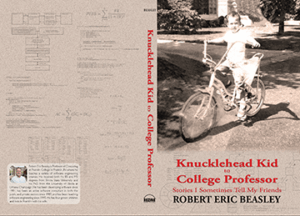 Book Cover: I was so grateful for the opportunity to do a book cover for an author of an actual published book. One thing that made this project stand out was that I got to practice my social skills with a customer. Many facetimes and emails back and forth, fixing things on the fly, and getting last-minute changes. I am glad I could help Professor Beasley bring his idea to life, but talking with someone not well-versed in Photoshop or InDesign made it hard for me to make him understand the time required to make his design. Within the cover itself, I was sent the two photos and was given the color scheme, then I had to find the color code that he was describing and convey it in the design. The rest of it was made piece by piece, and it was hard for me to express that in a way that wouldn’t sound inexperienced to the customer because of how much time was required. Even the two photos I was given had to be edited and redownloaded to get them proportioned correctly. Another bump in the road that we ran into was the fact that we were looking at it on a computer screen and not actual printed text, so it was difficult for me to describe how the color on the screen would look a little bit brighter than it would when printed and distributed. I am glad the professor was so understanding at the time about what I was trying to explain, and I could give him the design he wanted. All in all, getting this kind of exposure and experience in my college makes me believe that I now have ways to improve and learn for when I have my own customers. View PDF
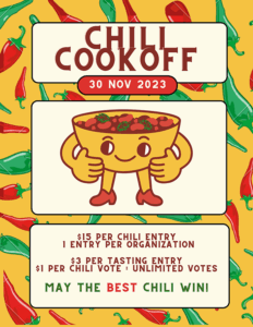
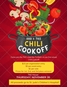
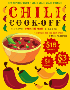
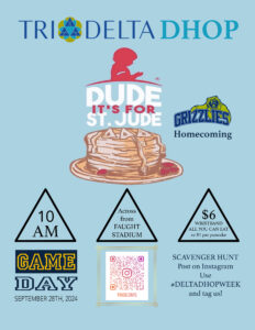
Delta Delta Delta Promotions